Group Brand Development
Situation & Task
This semester’s focus was on collaborative projects, with teams randomly assigned to encourage professional teamwork. Unlike working with friends, I find that this environment helps me maintain focus and professionalism. For the first three weeks, our task was to develop a brand identity for our group, including name, visual style, and overall presentation.
Action
I actively contributed to brainstorming and refining our group’s brand direction. This included generating ideas for names, visual motifs, and stylistic themes, as well as providing input on color palettes, typography, and initial design concepts. I also helped synthesize feedback from the team to ensure our brand was cohesive and represented our shared vision.
Result
Our collaborative efforts produced a clear, distinctive brand identity that reflected the team’s style and values. My contributions helped shape both the conceptual and visual direction, providing a strong foundation for subsequent project work.
Reflection
This experience reinforced the importance of clear communication and idea synthesis in group settings. By contributing constructively without personal bias, I was able to support a professional workflow and help the team develop a coherent brand identity efficiently.
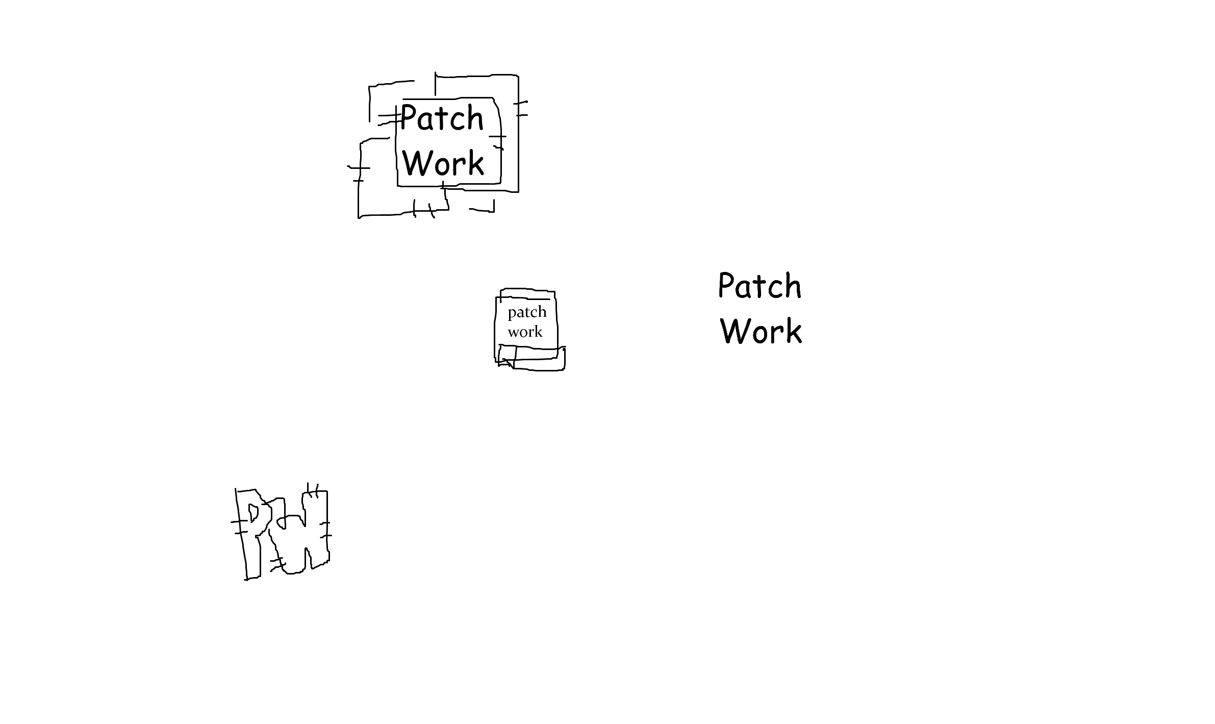
Logo Sketching & Early Concepting
Situation & Task
On the first day of the brand development project, our group had just finalized a name for our team. The next step was to begin exploring visual identities through logo design.
Action
I immediately started sketching low-fidelity logo concepts to get my ideas onto paper. While the sketches were rough, they captured the initial vision and helped the team visualize potential directions. This proactive approach allowed me to jumpstart the project and contribute to early creative momentum—what the Dutch call “de kop eraf hakken” (getting the first step done).
Result
The sketches provided a starting point for discussion and refinement, giving the team multiple concepts to evaluate and build upon. My early contribution helped set a productive pace for the project.
Reflection
This experience highlighted the value of proactive ideation in group work. By beginning work immediately, I was able to contribute ideas, inspire discussion, and help the team gain early clarity on the visual direction.
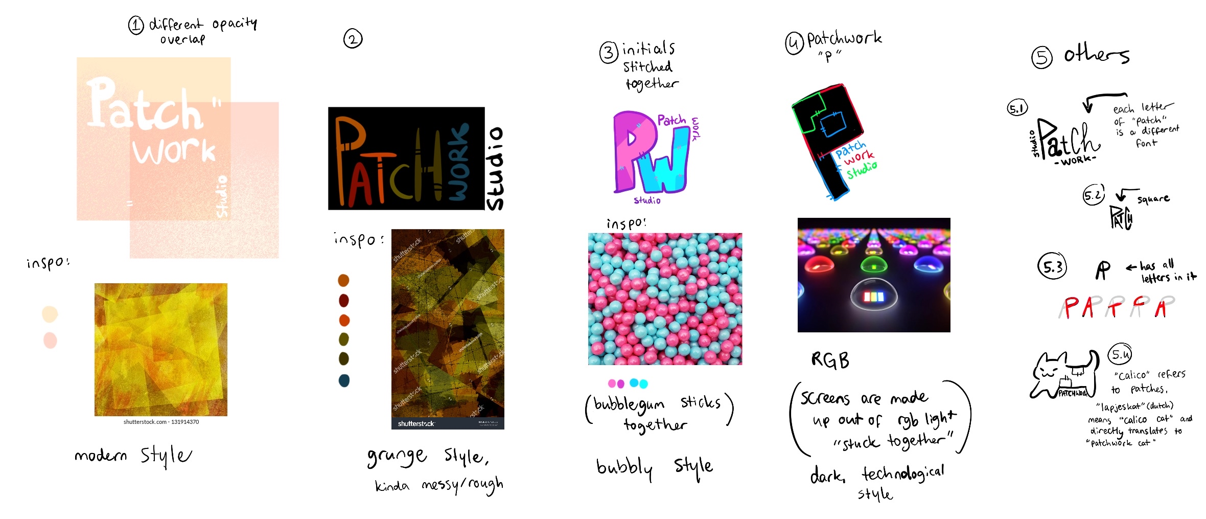
Developing Logo Concepts & Brand Aesthetics
Situation & Task
After producing initial logo sketches, I realized the logo needed to align with the broader brand identity. The goal was to create visuals that reflected our team’s style, values, and the services we aimed to provide.
Action
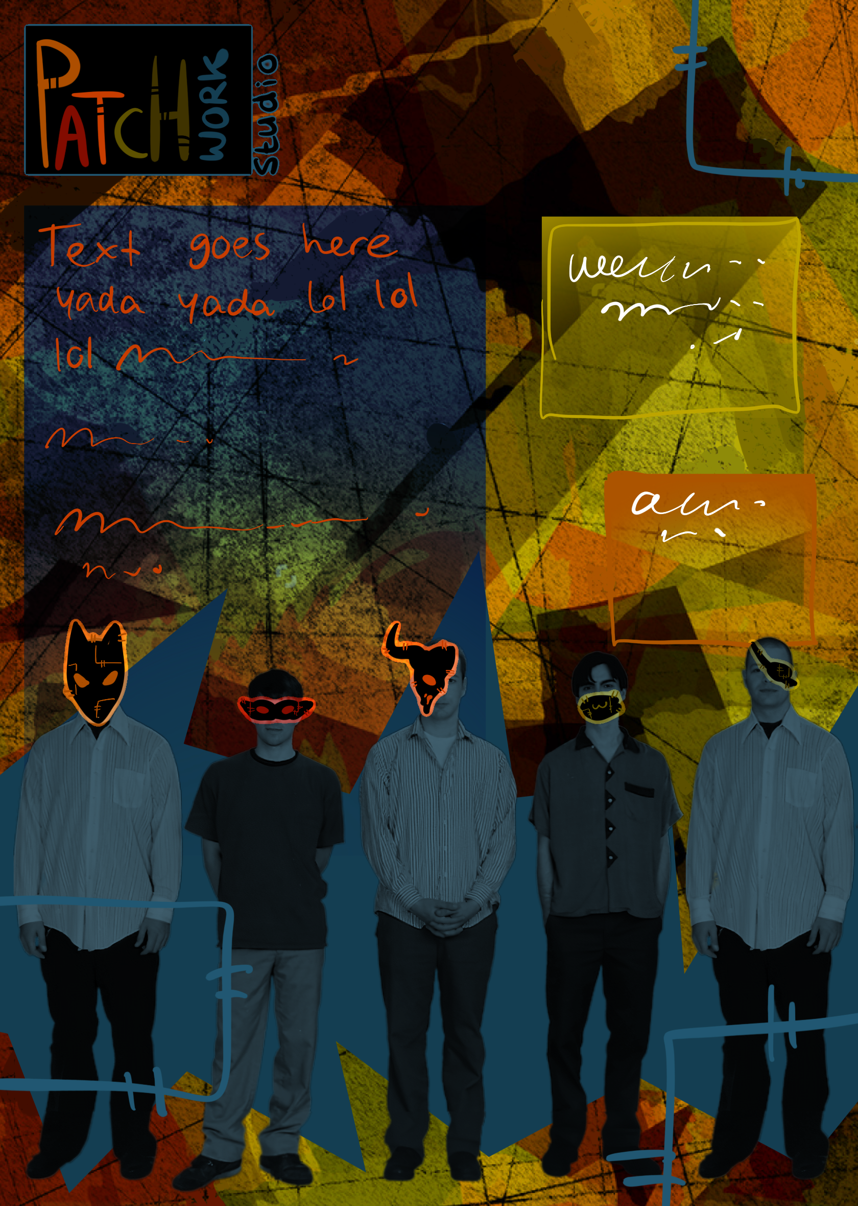
I conducted research on patchwork patterns and design inspiration online, considering how the brand’s aesthetic could be represented visually. Using this as a foundation, I developed several logo concepts that were deliberately diverse, experimenting with different colors, styles, and fonts to explore a wide range of possibilities.
To demonstrate practical application, I also created a poster concept incorporating one of the aesthetics, showing how the branding could function in a real-world context.
Result
The logos and poster concept provided the team with multiple directions to evaluate and discuss, helping clarify which styles and visual languages best matched the brand’s identity. My designs also offered a tangible preview of how the brand could be applied in practice.
Reflection
This stage reinforced the importance of cohesive design thinking: creating logos in isolation is useful, but considering how they fit into broader applications ensures that the branding is versatile and effective. It also highlighted how exploration and iteration can uncover unexpected creative directions.
Refining Logo Concepts & Navigating Feedback
Situation & Task
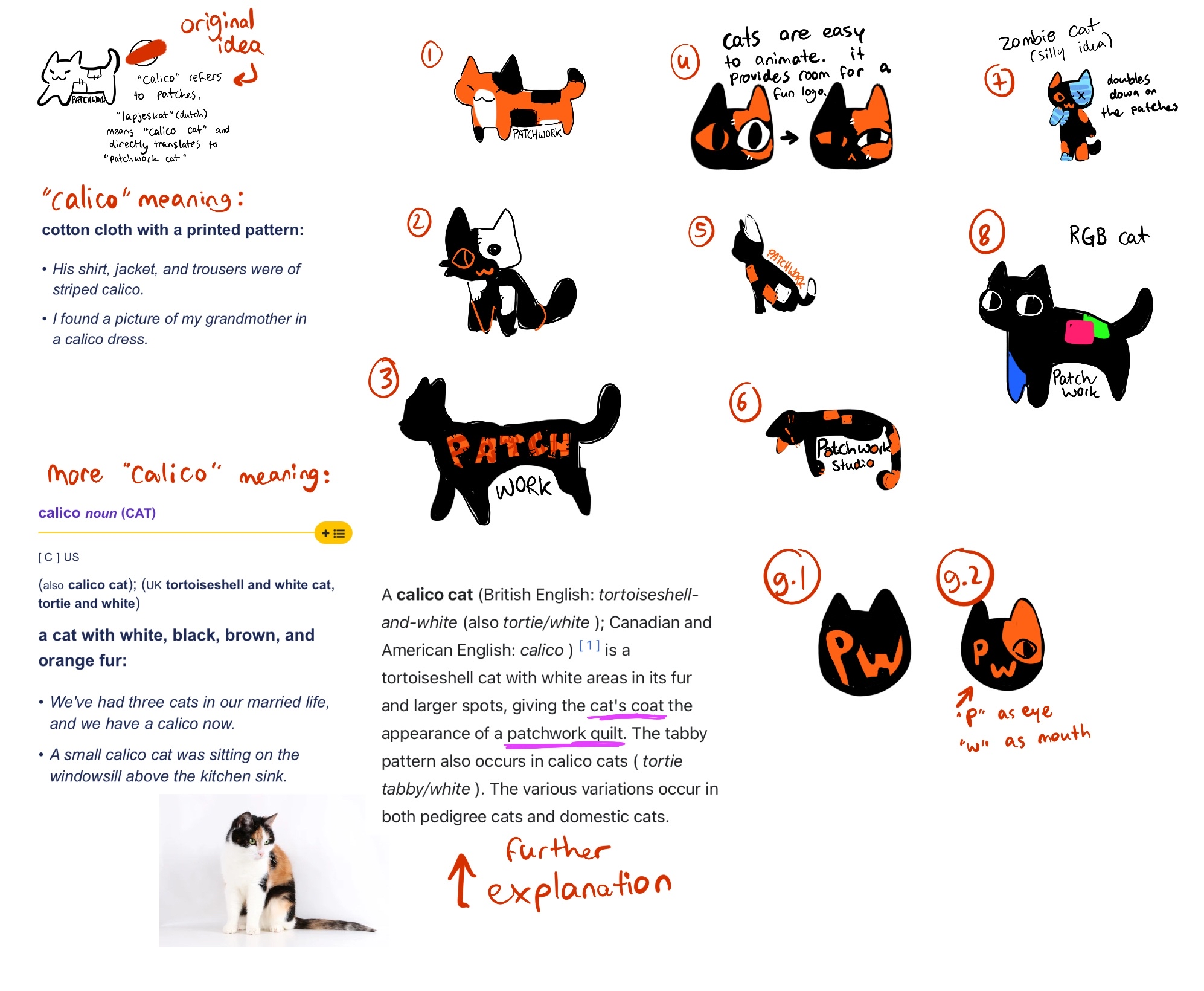
After presenting the initial logo concepts, my team was particularly enthusiastic about the small calico cat idea. However, our teachers questioned whether it was fully relevant and representative of the brand. My task was to clarify and strengthen the concept to better communicate its suitability.
Action
I created a more detailed visualization of the calico cat logo, documenting my thought process and multiple iterations to show how the design aligned with our brand identity. This included explaining the design choices, color decisions, and stylistic considerations behind the concept.
Result
Despite the additional detail and explanation, the teachers remained unconvinced that this logo was the best fit for the brand. As a result, the team decided to move forward with a logo proposed by a teammate.
Reflection
This stage emphasized the importance of balancing personal creativity with outside expectations. While my concept was not selected, the process reinforced how detailed visual reasoning and iteration can clarify ideas, and how sometimes compromise is necessary to support team alignment and project progress.
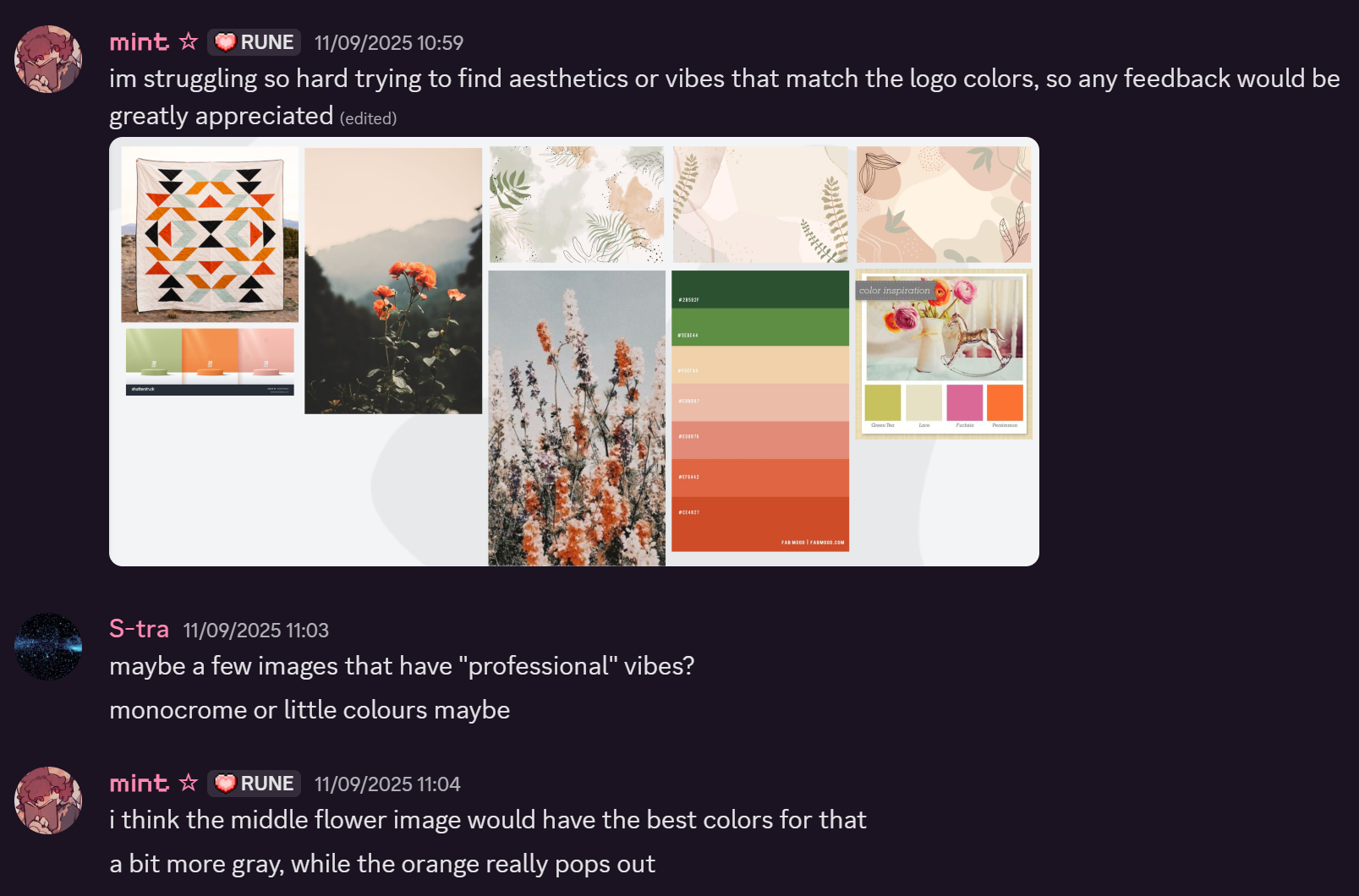
Logo Moodboard Development
Situation:
A teammate presented an initial logo idea for our studio, but the team needed a clearer visual direction to ensure the branding matched our identity.
Task:
My role was to support the logo concept by developing moodboards that would help define the overall vibe, tone, and color direction of the brand.
Action:
I researched a variety of logo styles and patchwork-inspired visuals and curated multiple moodboards. After reviewing different approaches, I chose a direction that felt fresh and colorful, while still incorporating sharp, square patches to maintain a professional structure.
Result:
The moodboards helped align the team on a clear visual direction. The colorful palette communicates approachability and playfulness, while the structured shapes preserve a polished and professional look suitable for a creative studio.
Reflection:
This process showed me how powerful moodboards can be in shaping design decisions early on. It reinforced the importance of balancing creativity with clarity, and how intentional color and shape choices can strongly influence how a brand is perceived.
Applying Moodboard Colors to the Logo
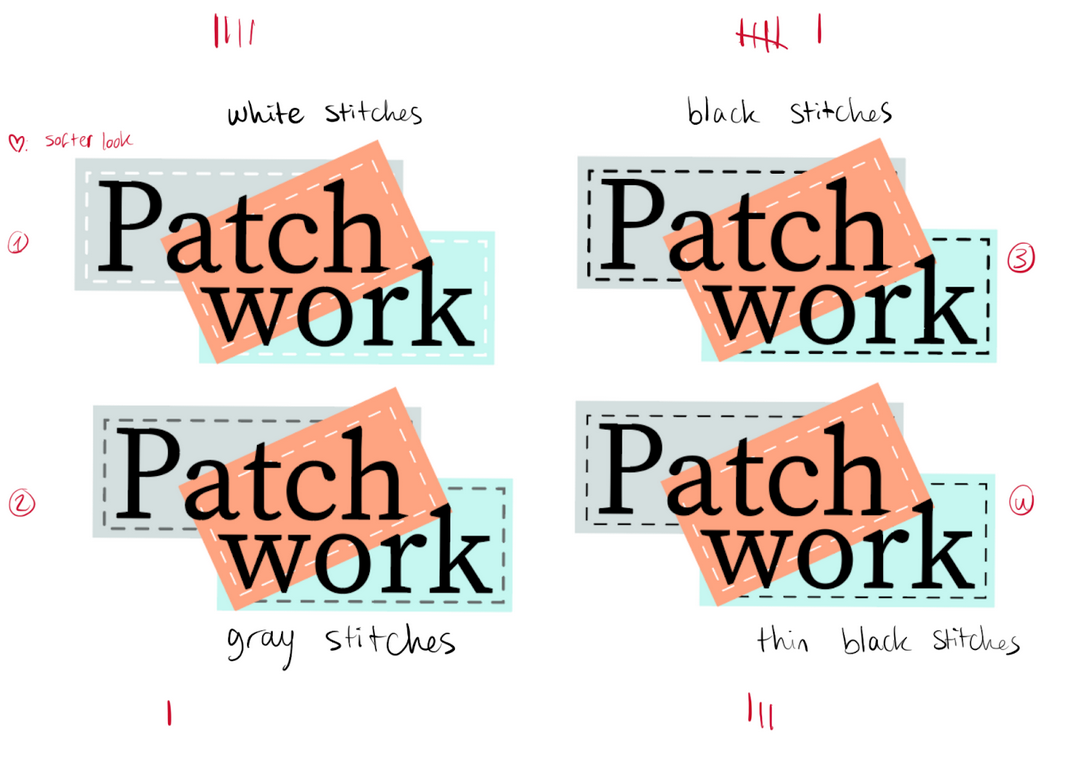
Situation & Task
With the team’s logo chosen, the next step was to apply the colors from our brand moodboard to ensure visual consistency and alignment with the overall brand identity.
Action
I experimented with multiple color applications on the logo, testing different combinations for both text and stitching elements:
- Image 1: Purple text, which I realized did not translate well on-screen.
- Image 2: Stitch colors that clashed with other elements.
- Images 3, 4, and 5: Refined combinations that were visually appealing and aligned with the brand’s aesthetic, ready for further testing with the team and stakeholders.
Result
Through iterative testing, we identified color schemes that enhanced readability, harmonized with the brand moodboard, and maintained the playful tone of the logo.
Reflection
This stage reinforced the importance of iteration and testing in visual design. Color choices can appear differently across mediums, and experimentation is key to finding combinations that both look good and communicate the intended brand personality.
Logo Selection & Feedback Integration
Situation & Task
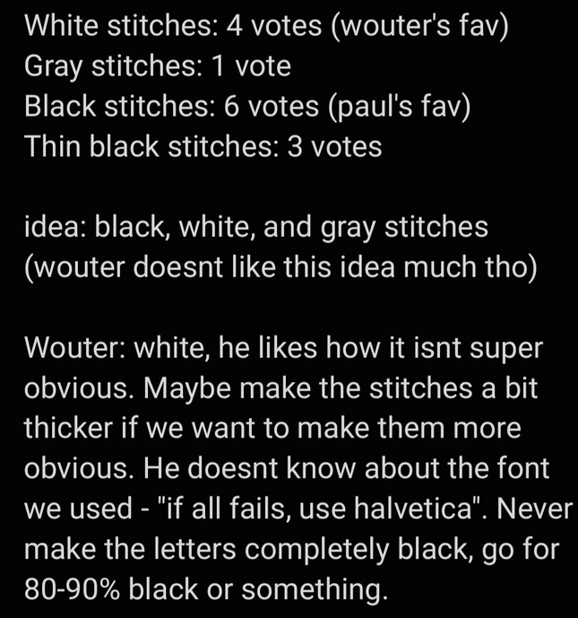
After creating multiple color variations for the chosen logo, the next step was to determine which version resonated best with the audience and teachers.
Action
We compiled the preferred logo options and presented them to the class, gathering feedback on readability, appeal, and alignment with the brand. We also consulted with the teachers to incorporate their professional insights.
Result
The version with black stitching was the clear favorite, and the team decided to proceed with this design. Additionally, I learned an important design principle: full black is rarely ideal for logos, as it can appear harsh or heavy in contrast.
Reflection
This experience reinforced the value of user and stakeholder feedback in design decisions. It also highlighted how iterative testing and attention to subtle details—like color choices—can significantly improve the final visual outcome.
Developing the Brand Guide
Situation & Task
With the logo finalized, the team decided to expand the project by creating a brand guide to define the visual identity and ensure consistency across all materials. I collaborated with a teammate to divide the work and tackle the project efficiently.
Action
I began by researching existing brand guides for inspiration, focusing on examples that were simple, bold, and memorable. My favorites were Uber and CoolBlue, with the latter standing out for its fun, highly recognizable style and restrained use of color. These examples informed my approach and helped guide decisions about layout, typography, and visual hierarchy.
Result
The research provided a clear framework for developing our own brand guide, allowing us to align design elements consistently and give the team a reference for future applications of the brand.
Reflection
This stage reinforced the importance of benchmarking and inspiration in design. Studying successful brand guides helped me understand how simplicity, color restraint, and bold visuals can create a recognizable and cohesive identity.
Developing the Brand’s Tone of Voice
Situation & Task
As part of the brand guide, I was responsible for defining the Tone of Voice—how our brand communicates through language. This was a key element to ensure that our visual identity was supported by consistent messaging.
Action
I researched examples from other brands and attempted to create sample content in Figma to illustrate the tone for our brand. Despite multiple iterations, I struggled to achieve a version that felt authentic and aligned with our overall identity. I also sought feedback from both teachers and teammates, but did not receive clear guidance.
Result
Although my initial attempts did not finalize the Tone of Voice, the process helped clarify what direction the brand ultimately needed to take. The final Tone of Voice was adjusted later to better reflect the brand’s personality and audience.
Reflection
This experience highlighted the challenge of defining intangible brand elements like voice and tone. It reinforced the importance of collaboration, external input, and iteration, and reminded me that some aspects of a brand may evolve over time rather than being solved in a single attempt.
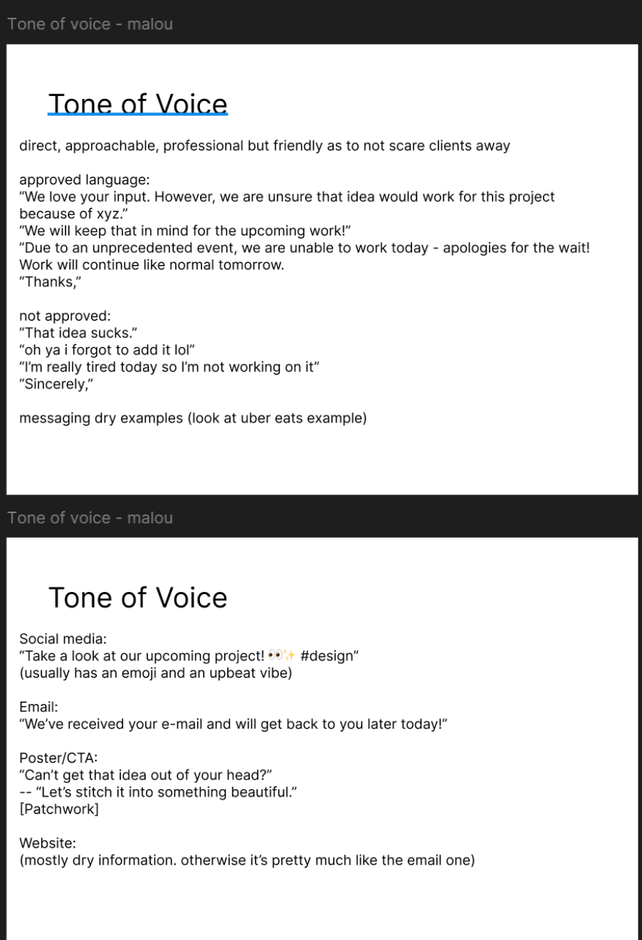
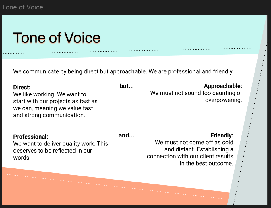
Finalizing the Tone of Voice Page
Situation & Task
After iterating on the brand’s Tone of Voice, the goal was to create a comprehensive and visually aligned page for the brand guide that clearly communicated the intended communication style.
Action
The finalized page provides a broader explanation of the brand’s desired vibes, describing how the brand should sound and feel across different channels. I also applied our studio’s visual style to the layout, incorporating geometric patch shapes and the selected color palette to maintain consistency with the rest of the brand guide.
Result
The completed page effectively communicates the Tone of Voice while reinforcing the visual identity of the brand, combining both content and design in a cohesive format.
Reflection
This stage emphasized how design and messaging can work together to strengthen brand identity. Styling the page in our established visual language not only made it more engaging but also reinforced consistency and recognizability across the brand guide.
Completing the Brand Guide
Situation & Task
After developing the logo, color palette, and visual style, the next step was to compile the full brand guide, ensuring consistency and clarity across all pages. My focus was on the title page, typography page, and Tone of Voice.
Action
I spent extended sessions styling and decorating the pages, applying our studio’s geometric patch motif, chosen colors, and visual hierarchy principles. While much of the work involved repetitive tasks, it allowed me to refine the visual consistency and overall polish of the guide.
Result
The completed brand guide consolidates our visual identity, messaging, and stylistic guidelines in a cohesive, professional format. It serves as a clear reference for the team and future applications of the brand.
Reflection
This stage reinforced my enjoyment and strength in styling, decorating, and visual design. Even in repetitive work, attention to detail and thoughtful design choices can elevate the final product and create a polished, cohesive outcome.
Professional Group Photography
Situation & Task
As part of presenting our team professionally, we wanted high-quality images to represent who we are. Our goal was to capture the team’s identity in a polished and visually engaging way.
Action
We visited Fontys’s Pixel Playground, a studio equipped with professional photography technology. Jan guided us through the equipment and explained its functionality. We were then given the opportunity to experiment with the studio tools, practicing lighting, framing, and composition while maintaining professional conduct.
Result
The session allowed us to capture professional-quality images that reflected our team’s personality and cohesion. It also provided hands-on experience with advanced studio equipment and techniques.
Reflection
This experience highlighted the value of practical experimentation in professional environments. Learning to use high-end equipment and working collaboratively as a team reinforced both technical skills and the importance of presenting a consistent, professional visual identity.
Creative Identity: Cartoon Masks
Situation & Task
After our professional photoshoot, we decided that the team preferred not to show our faces in the final images. The challenge was to create a solution that maintained privacy while still making the images engaging and visually aligned with our brand.
Action
I proposed designing cartoon masks to overlay on our faces, giving the team a unique and recognizable identity. Originally, these were intended as real-life props, but time constraints prevented us from producing physical versions. I consulted my teammates to determine which animals they wanted me to illustrate, and I ensured that all masks adhered to our studio’s color palette. For myself, I chose a jackalope, combining my personal affinity for bunnies (aligned with my username, “ishybun”) with a distinctive, eye-catching design.
Result
The cartoon masks provided a playful, branded identity for the team images, making our portraits visually engaging while maintaining anonymity. They also helped our team stand out and reinforced the studio’s creative style.
Reflection
This task emphasized the value of creative problem-solving and personal expression in team projects. By combining privacy, branding, and fun visuals, I was able to contribute a solution that strengthened both our identity and our visual cohesion.

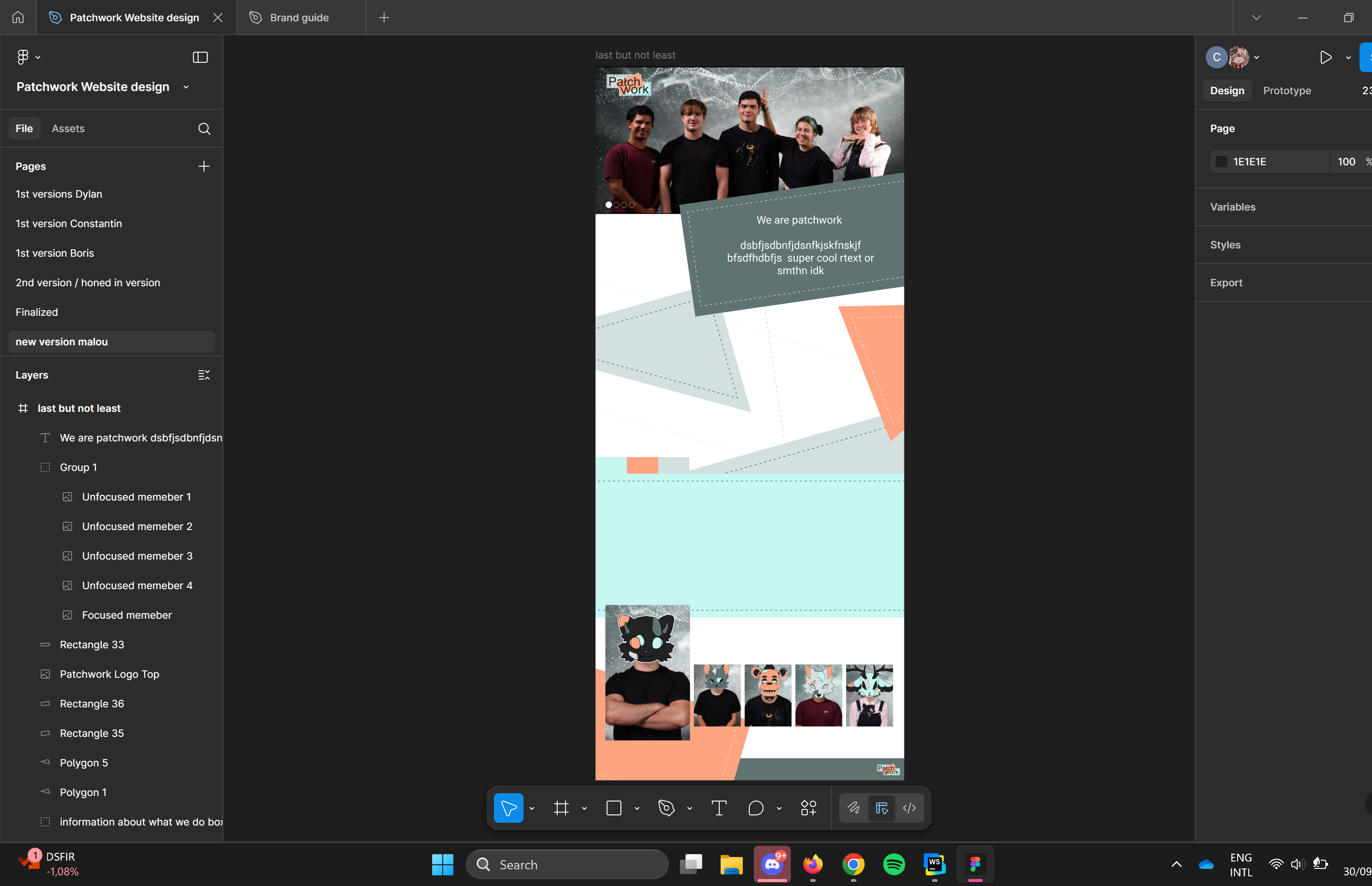
Supporting Website Design
Situation & Task
Although website design was primarily handled by other team members, they encountered challenges in applying colors consistently with our brand guide. My task became assisting them in aligning the website visuals with the studio’s established identity.
Action
I iterated on their layout and applied color schemes based on our brand guide, testing different combinations to ensure readability, visual balance, and cohesion with the rest of the brand materials. This mainly included refining the background and accent elements to maintain consistency across the site.
Result
The website layout became visually consistent with the brand identity, supporting a professional and cohesive presentation of the team online. My input helped the group overcome color-related issues without altering the original layout design.
Reflection
This experience reinforced the importance of collaboration and flexibility in team projects. Even when a task is not officially assigned to you, contributing your expertise can improve the overall quality and cohesion of a shared project.